fredag 29 augusti 2014

Four year anniversary!!!!


Today I was thinking that I needn’t do any update because I wasn’t done with the analysis yet... But then I realized that it’s the four year anniversary today! It’s cliché but time really does fly away!

Since the last anniversary I finished my first longer comic (Pilgrim), which fills me with great pride! Since then I’ve finished three more scripts. Currently I’m analyzing some drawing styles that I like, to prepare me for the design process that will start soon.

To have a blog like this is a process, and I do some thinking about which direction I want it to have. These past months I’ve been thinking about if I should start writing about things I like that is already out there, like everyone else does... But I decided to keep it simple and about my own creativity, this blog will continue to be a place where I can show stuff, for those who are interested.

Take care!

fredag 22 augusti 2014

Some more analysis.

The analysis continues here, below are some scans of the drawings so far. I'm getting closer and closer to the end of the analysis. It will be very interesting to see if something has stuck from the analysis to the character design or if I’ve been wasting my time... I think it will bear some fruit, I just don’t no what kind yet...


The woman on the left are from an album cover, from the comic Roco Vargas by Daniel Torres. I liked this one because it was in the clear line style/ligne claire. The bathing beauty and the following pages are characters from a blog which features drawings by Bruce Timm.


These drawings are analyzed from the comic Theos Ockulta kuriositeter/The Occult Curiosities of Theo by Ola Skogäng. I like his style because it is in the clear line style in a contemporary setting.


Writing about the clear line style, it would be impossible to not include Tintin by Hergé. Funny note, the Tintin character seems to be fairly easy to draw, but as you see on the second one, the character isn’t quite there...


Two women from the Skogäng universe and one from Hergé.


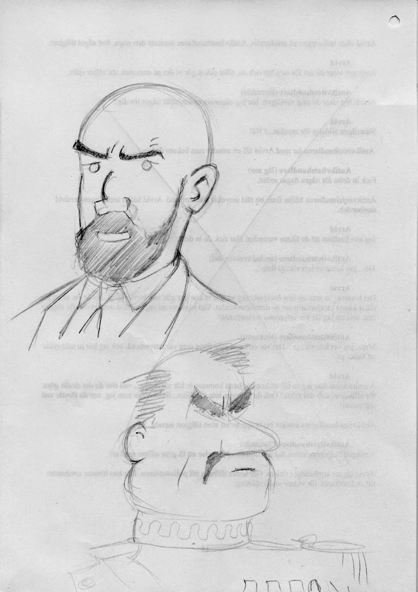
These two gentlemen are from the Hergé universe, I made these quite fast, hence their sketchiness...

måndag 11 augusti 2014

The Analysis continues! Redux!

Well, what can I say, I felt bad to post stuff with photography of sub quality, so I scanned the suckers instead! For information of the drawings read the post below, it’s the same drawings! I’ve focused here on the style of Bruce Timm, save the first page which is from Wizard magazine.

As I’ve written below I’m analyzing/copying various styles to see what makes them great. When I do get to do my own character design I hope that it will be of a good mixture of inspirational material and my own creativity. Even though it would be kind of cool to be a Bruce Timm-copy, I don’t think he would think that would be as great as I would... But to tell you the truth I don’t know how the actual character design process will be like. So stay tuned!

One last thing, when I started this process I made a time schedule to help me be on track. That worked for a week or so... According to that schedule I would be in the middle of the character design process by now... but I think thusly, it’s better to let this phase take it’s time, and make sure that the quality will be as high as I can muster. Instead of hurrying something forward that will be of poorer quality.

Take care!


As I’ve written below, for the drawings below I paused my dvd-player and tried to get the character right for a limited period of time, so that is the reason why they are a bit more sketchy!


fredag 8 augusti 2014

The analysis continues!

The analysis continues here, although I’m coming closer to finishing it. I think this is a valuable exercise, and I hope I will gain from it later on in the process.

Here are some pictures, unfortunately my camera is acting up so the drawings are much better, really, I promise... ;-)

Take care!


This photo actually works! The second drawing here and on to the "Justice League-ones" are from comics adaptations in an animated style inspired by artist Bruce Timm. I’ve taken these from two issues of Swedish magazine Gigant 3 and 4 from 2001. The drawings on Catwoman above are from an issue of Wizard.


 Here the camera decides to not participate...


On the second drawing above (on Batman), my reference was a paused episode of the tv-series "Justice League". This gave me less time to "get it right" so the following drawings are quite quicker and more in the line of studies. I kind of focused here on Hawk Girl because it’s a character that I know quite little about. Hawk Man is a character for me that pops up somewhere and is cool, I have to read something with that character...
The fact that I paused a tv-show sent me back in my mind to when I was a kid and paused "The Gummi Bears", to draw the characters from that show...


The second drawing above and the drawing below on Catwoman are from "Batman TAS" season one I think, a kick ass show...